Start building fast with Flexer Project, beautiful and modern websites with vertical navigation
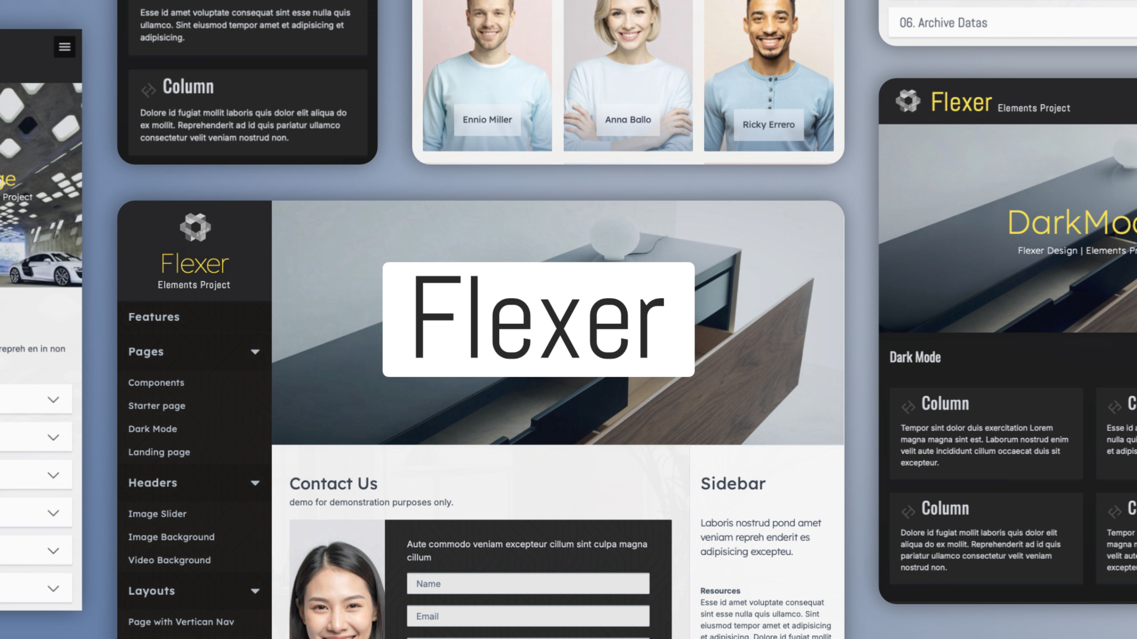
Flexer adapts seamlessly to any screen size. With its always-visible side navigation and a page layout that includes a responsive sidebar, every piece of content aligns perfectly across all devices.
Flexer is the ideal solution to make full and refined use of the available space.
Fully Responsive Layout: Crafted with a mobile-first approach, the template's fully responsive structure guarantees a perfect and seamless experience on every device, from desktops to smartphones.
Ready to use: Flexer is a complete project that includes all the standard pages needed to build a real-world website. You can use the STARTER page as a master template and customize Flexer for your own project.
Multiple layouts: With Flexer, you can create different layouts from the same project. You’ll find all the applied examples included.
Built with Standard Elements Tools: Crafted using the native features of Elements, ensuring ease of use, full compatibility, and straightforward customization.
Dark Style & variations: Dark mode and styles are fully supported.
Edit with Speed: Flexer (like all our Elements projects) offers a smart search to find what's editable — just type "edit." Find and edit elements instantly with our logically named, search-friendly sections. Intuitively named elements make editing faster. Change the content or size values with ease.
Bult-in Web-Font: Flexer provides 5 built-in fonts ( works offline 100%GDPR ).
Free Components in then project: Back to Top, Progress Bar, Info Pop-Up and Fade-In Body.