Transform any page into an immersive, step-by-step guided journey with powerful spotlight effects and complete design freedom.
Guide your visitors through an immersive digital journey, transforming any web page into an interactive, step-by-step storytelling experience directly inside your Elements project.
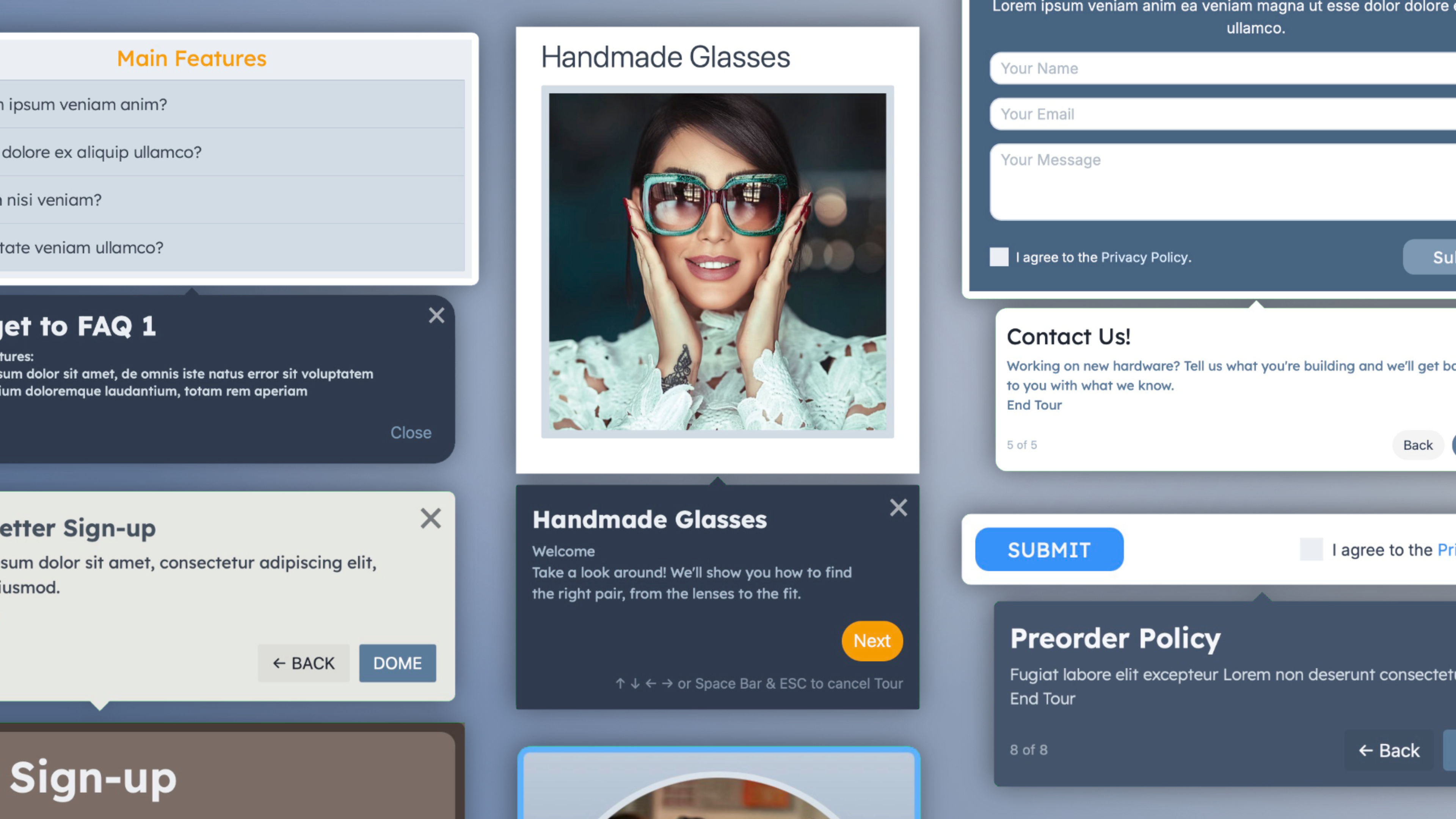
More than a simple tooltip or guidance widget, Tour empowers you to orchestrate seamless product walkthroughs, onboarding flows, and feature highlights with absolute precision. With flexible layouts, independent styling for each step, custom typography, backgrounds, spacing, animations, and visual spotlight indicators, you can create anything from a subtle UI highlight to a rich cinematic presentation that perfectly matches your design.
Built-in positioning controls, spotlight masks, interactive triggers, smooth transitions, and advanced navigation handlers make even complex multi-step sequences effortless to explore, while responsive controls let you adapt every step for every device.
When your project requires it, the component can seamlessly adapt to different user intents, offering dedicated accessibility settings, keyboard navigation, and flexible trigger mechanisms.
Built exclusively for Elements, fully responsive, and designed to give your visitors a clearer, more engaging way to discover your content and features.
From seamless user onboarding and complex layout tours to e-commerce product discovery and interactive e-learning, this versatile tool adapts to any scenario where guiding attention or explaining interface elements matters.
Key features:
- Automatically builds and orchestrates step-by-step tours directly within your Elements project.
- Advanced spotlight effect to elegantly dim the background and focus attention on specific page elements.
- Flexible positioning controls for tooltips and popups (top, bottom, left, right, auto-fit).
- Independent styling for tour cards, titles, descriptions, and action buttons.
- Multiple trigger options including automatic load, button click, or scroll position.
- Interactive step navigation with Next, Back, Skip, and custom Finish actions.
- Smooth transitions and animated focal shifts between tour steps.
- Progress indicators, step counters, and custom badge options.
- Custom drop zones for embedding images, icons, or custom Elements inside tour steps.
- Keyboard accessibility and robust focus trapping for enhanced screen reader support.
- Responsive visibility and positioning controls for every breakpoint.
- Complete typography, backgrounds, transforms, and transition controls.
..and more
Everything you're browsing right now comes with the component: this very site, with all its demos, ready to open and edit. Every page shows a different configuration, interactive tours, and guided workflows, from the most essential to the most advanced. Pick the ones that fit your project, drop them in, and make them yours.
ⓘ Once installed, you'll find the demo project in the available projects panel when creating a new one. (Expand the list with ‘view all’, See all library items, to see all projects.)