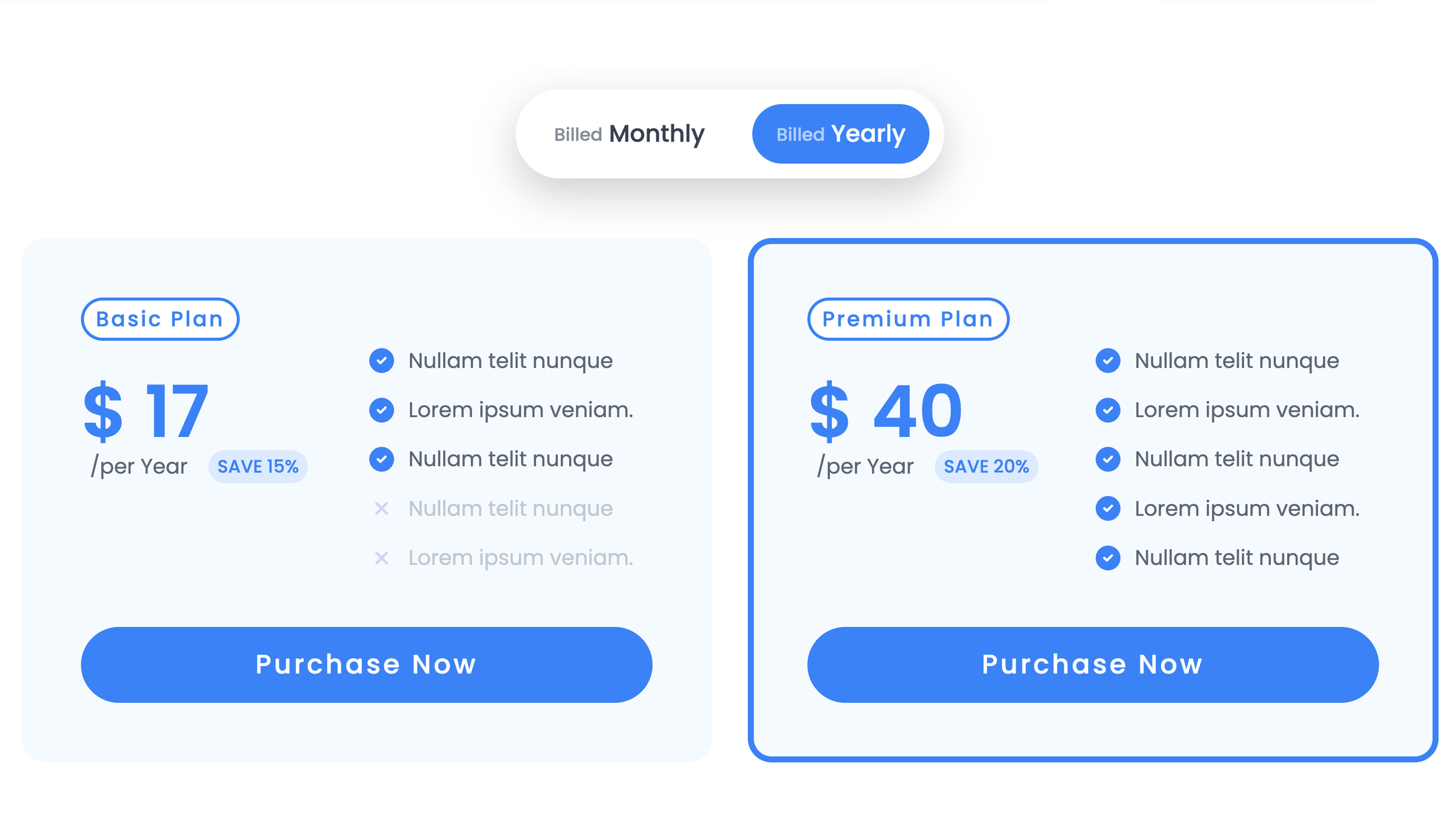
A toggle component that lets visitors switch between two content states — pricing plans, themes, before/after, layouts — with smooth animations and four trigger styles. No code required.
Toggler offers four trigger types: Pills (with sliding indicator), Labels, Switch (four variants: standard, icon, inner text, thin), and Custom (free dropzone). Toggle between two content dropzones or use Selector Mode to apply animated CSS transitions (opacity, scale, translate, blur, shadow, max-height) to any element on the page. Supports sticky trigger, localStorage persistence, auto-scroll on switch, and height animation between states. Full responsive control across all breakpoints.