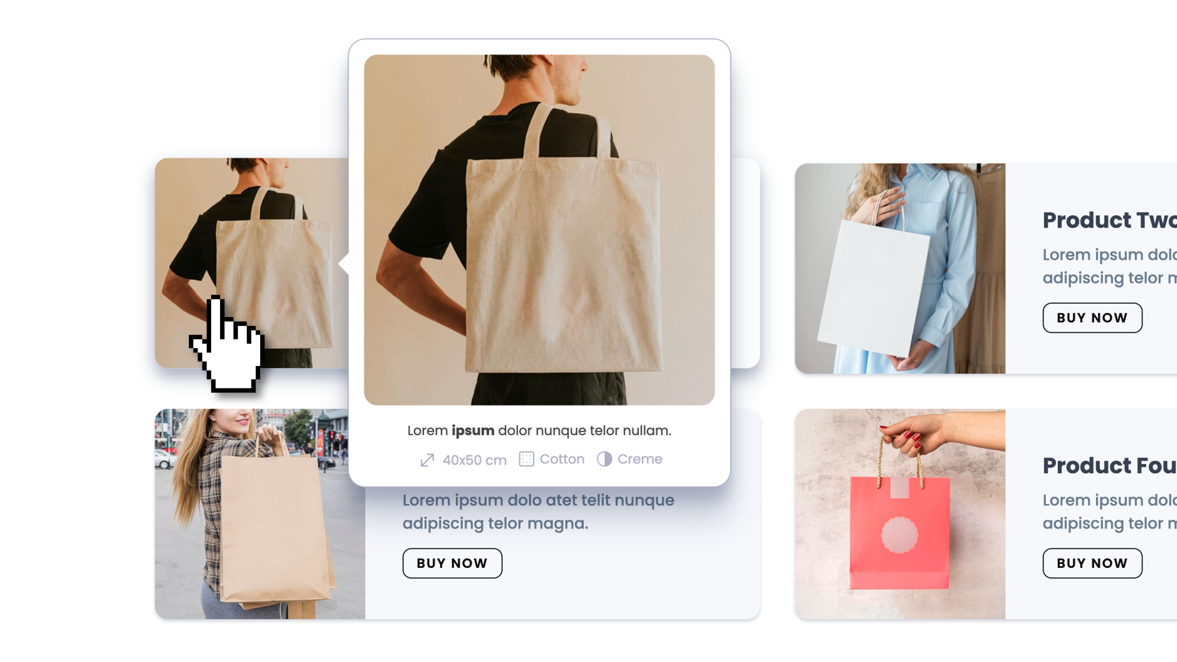
A popover and tooltip component for any kind of contextual content — tooltips, hover previews, help popovers, confirmations, action menus, annotations. Smart auto-positioning, three interaction modes, and full theme integration. No code required.
Float supports three interactions (Click, Hover, Both — with click-locking and hover re-anchoring in Both mode), two trigger sources (a built-in Dropzone, or any CSS class on the page so multiple elements can share the same Float), and an External Control option to open the same Float from any element anywhere on the page (footer link, navbar button, sidebar item) while keeping it anchored to its main trigger. Auto-positioning flips to the opposite side near viewport edges and shifts the popover to stay in view, while the caret keeps pointing at the actual trigger and stops at the rounded-corner radius for a clean attached look. Sizing presets: auto-fit content, match the trigger's width or height (perfect for caption-style overlays or full-cell image grids), or pick a theme spacing token. Visible-until-dismiss or auto-close-after-timeout (with pause-on-hover for readers). Six entry/exit animations (Fade, Scale, Slide Up/Down/Left/Right) with configurable duration. Customizable caret with theme color, opacity, and scale. Click-outside, ESC, trigger-again, and mouse-leave dismissal options — each independently togglable. Touch fallback automatically converts Hover and Both modes to Click on touch devices, so the same Float configuration works seamlessly on mobile. Full responsive theme integration on every visual property — background, border, padding, radius, shadow.